

# A tibble: 2 x 3
  st    meanspeed meanpace
1 R         12.8      4.81
2 W          6.05    10.5
# A tibble: 11 x 4
   Stage Type  meanspeed meanpace

1     1 R         14.4      4.29
2     2 W          6.35     9.92
3     3 R         12.3      4.93
4     4 W          5.73    11.4
5     5 R         12.5      4.90
6     6 W          6.38     9.87
7     7 R         12.6      4.83
8     8 W          6.03    10.8
9     9 R         12.1      4.99
10    10 W          5.66    11.0
11    11 R         12.6      4.93
Notes
library(tidyverse)
library(plotKML)
library(lubridate)
great_circle_distance <- function(lat1, long1, lat2, long2) {
a <- sin(0.5 * (lat2 - lat1)/360*2*pi)
b <- sin(0.5 * (long2 - long1)/360*2*pi)
12742 * asin(sqrt(a * a + cos(lat1/360*2*pi) *
cos(lat2/360*2*pi) * b * b))
}
gpx.raw <- readGPX("HIIT.gpx")
df <- as.data.frame(gpx.raw[[4]])
colnames(df) <- c("lon","lat","ele","time")
df2 <- df %>% mutate(ele = as.numeric(ele),
time = ymd_hms(time),
lon2 = lag(lon),
time2 = lag(time),
deltat = time - time2,
lat2 = lag(lat),
dist = great_circle_distance(lat, lon,lat2, lon2),
speed = dist/as.numeric(deltat)*3600,
pace = as.numeric(deltat)/dist/60,
st = if_else(speed >= 9, "R", "W"),
change = if_else(st == lag(st), 0 ,1)) %>%
drop_na() %>%
mutate(Stage = cumsum(change))
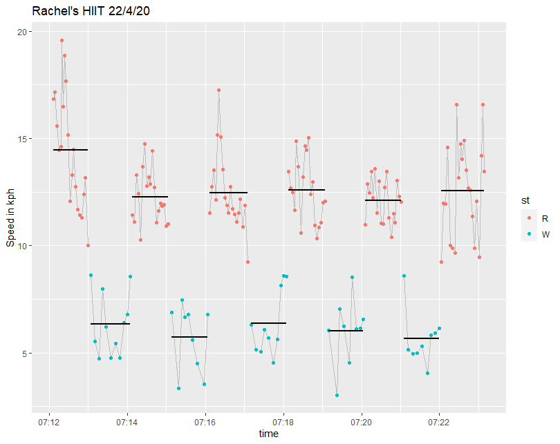
df2 %>% ggplot(aes(time, speed)) + geom_line(colour = "grey") + geom_point()
df2 %>% filter(pace < 22) %>% group_by(st) %>% summarise(meanspeed = mean(speed), meanpace = mean(pace))
df2 %>% filter(pace < 22) %>% group_by(Stage) %>% summarise(Type = first(st), meanspeed = mean(speed), meanpace = mean(pace))
df2 %>% filter(pace < 22) %>%
ggplot(aes(time, speed, colour = st, group = Stage)) +
geom_line(aes(time, speed),colour = "grey") +
geom_point() +
stat_smooth(method="lm", formula=y~1, se=F, colour = "black") +
labs(title = "Rachel's HIIT 22/4/20", y = "Speed in kmh")
R for Excel Users – Part 5 – How to Save the Results of Your Analysis
Solution 1
Solution 2
If you want to include some nice markdown text in your document but don’t want to copy the R code from elsewhere, for the reasons described above, you can simply run sections of code contained in the script file from within the markdown document. All you need to do is firstly source the R script file and then put the section of the script you want to run after the in “`r in a markdown document and before any options you choose.
library(knitr )

```{r cache =FALSE, echo =F}
read_chunk("script.R" )
```

```{r Section12, echo =F}
```
The section is indicated by putting # —- Section12 —- in the script document.
R script file (correlation2.R)
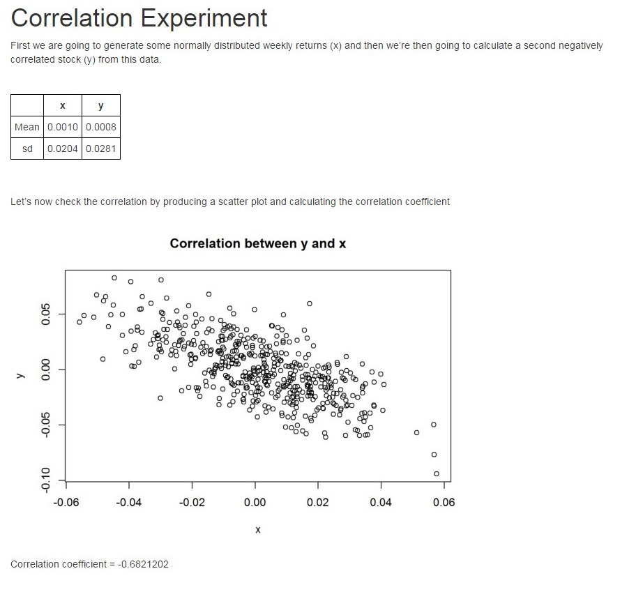
# ---- Section1 ----

library(rmarkdown)
# Calculate x

x <- rnorm(500, 0.001, 0.02)
xbar <- mean(x)
xsd <- sd(x)

# Calculate y which is inversely proportional to x

y <- 2*xbar-x + rnorm(500, sd = 0.02)
ybar <- mean(y)
ysd <- sd(y)

# ---- Section2 ----

xysummary <- matrix(data = c(xbar, xsd, ybar, ysd), 2, 2)
colnames(xysummary) <- c("x","y")
rownames(xysummary) <- c("Mean","sd")

# ---- Section3 ----

plot(x,y, main = "Correlation between y and x")

# ---- Section4 ----

cc <- cor(x,y)

# ---- Section5 ----

render("correlation2.Rmd","html_document", output_file  = "CorExpt.html", envir = .GlobalEnv)
browseURL(paste('file:///',getwd(),"/","CorExpt.html", sep=''))
R markdown file (correlation2.Rmd)
---
output: html_document
---
<style type="text/css">

th{

border:1px solid black;
padding:5px;
text-align: center;
}

td{

border:1px solid black;
padding:5px;
text-align: center;
}

table{
border-collapse:collapse;

}

</style>

```{r cache=FALSE, echo=F}
library(knitr)
read_chunk('correlation2.R')
```

# Correlation Experiment

First we are going to generate some normally distributed weekly returns (x) and then we're then going to calculate a second negatively correlated stock (y) from this data.

<br>

```{r echo=F, results='asis'}
library(xtable)
print(xtable(xysummary, digits = 4), type="html")
```
<br>
<br>

Let's now check the correlation by producing a scatter plot and calculating the correlation coefficient

```{r Section3, echo=F}
```

Correlation coefficient = `r cc`
Final output (Screen print so that the styling is retained)
Getting round some Yahoo Finance problems using Google Finance and R
Yahoo Finance is probably the most widely used free source of historic share price data. Normally it works really well and the integration into R packages like quantmod makes it an easy to use and powerful solution. However, it is not without problems. Here are a couple of them and some solutions using Google Finance. I’m only going to talk about London traded shares and UK based mutual funds. I will be using the UK version of Google finance https://www.google.co.uk/finance throughout.
Obviously spurious data
This normally only happens for shares with small trading volumes or with ETFs and not for FTSE350 companies. Here are charts for the same ETF (Vanguard S&P 500, VUSA.L) from Yahoo Finance and Google Finance. Using quantmod you can easily change the source to use Google instead of Yahoo. The moral of the story is to always check the basic chart before attempting any more sophisticated analysis.


Missing data
library(XML)
library(RCurl)
library(lubridate)
library(xts)


### Complete data required below

symb <- "INDEXFTSE:UKXMV"
fname <- "UKXMV"
startdate <- ymd("2014-01-31")
enddate <- ymd("2015-11-16")

## Construct basic URL

sd <- day(startdate)
sm <- month(startdate, label = T)
sy <- year(startdate)

ed <- day(enddate)
em <- month(enddate, label = T)
ey <- year(enddate)

basicURL <- paste("https://www.google.co.uk/finance/historical?q=",symb,
                  "&startdate=",sm,"+",sd,"+",sy,"&enddate=",em,"+",ed,"+",ey,"&num=200&start=", sep ="")

nrows <- as.numeric(difftime( enddate, startdate, units = "days")/7*5)

### Download data and merge into a data frame called DF


start <- seq( 0, nrows, by = 200)

DF <- NULL
for(i in 1:length(start)){

theurl <- getURL(paste(basicURL,start[i],sep = ""))
temp <- readHTMLTable(theurl, which= 4, header = TRUE, stringsAsFactors = FALSE )
DF <- rbind(DF, temp)
}

## Tidy up DF
colnames(DF) <- gsub("\\s|\\\n",'',colnames(DF))

DF[DF == "-"] <- NA

head(DF)
tail(DF)

DF[,1] <- mdy(DF[,1])
row.names(DF) <- DF[,1]
DF[,1] <- NULL

id <- c(1:ncol(DF))
DF[,id] <- as.numeric(as.character(unlist(DF[,id])))

head(DF)

## Convert the data frame DF into an XTS object

DF.xts <- as.xts(DF)
assign(fname, DF.xts)


head(DF.xts)
plot(DF.xts)
R for Excel Users – Part 4 – Pasting into a filtered table
If you have ever tried to paste into a filtered table in Excel you will know that this does not work as expected. Excel ignores the filtering and just pastes in the data starting from the first row selected. All the work arounds I’ve ever found didn’t work for me. The only guaranteed method is to sort the data and then manually find the rows where you want to paste in.
Thankfully, in R, it is very easy to complete this task.
Mapping in R
I’ve been having great fun getting to grips with drawing maps showing data in R. There is a good tutorial here and extra information here and here.
I decided to use the Royal Society for the Protection of Birds (RSPB) 2015 Big Garden Birdwatch. It took some time to align the data they give for “counties” with something I could find maps for. It therefore won’t be completely accurate especially as the result for a region is the simple mean of the sub regions.
It was a fun learning exercise though. Here are a couple of maps.

R for Excel Users – Part 3 – Merging data
In the last part of this series we looked at an R equivalent to VLOOKUP in Excel. Another use of VLOOKUP is to match data on a one-to-one basis. For example, inserting the price of a stock from a master prices table into a table of stock holdings. I can’t believe how easy this is to do in R!
Here are two data frames. One contains the phonetic alphabet and the other contains a message.
> head(phonetic)
  Letter    Code
1      A   Alpha
2      B   Bravo
3      C Charlie
4      D   Delta
5      E    Echo
6      F Foxtrot
> message
   No Letter
1   1      R
2   2      I
3   3      S
4   4      A
5   5      M
6   6      A
7   7      Z
8   8      I
9   9      N
10 10      G
To find the phonetic pronunciation of each letter in the message, all we need to do is to combine the two data frames using merge, ensuring that there is a column by the same name in each data frame. Unfortunately you can either sort it by the column you are using to combine by (“Letter” in this case) or not at all (ie random, or an anagram for free!) To get round this, I sorted by an extra ID column (called “No”) and then deleted it afterwards.
> result <- merge(message, phonetic, by = "Letter")
> result <- result[order(result$No),]
> result[,2] = NULL
> result
   Letter     Code
8       R    Romeo
4       I    India
9       S   Sierra
2       A    Alpha
6       M     Mike
1       A    Alpha
10      Z     Zulu
5       I    India
7       N November
3       G     Golf
This post from r-statistics.com helped me with the sorting idea and also describes an alternative approach using join from the {plyr} library. I know I need to get into {plyr} and it’s on my list of “known unknowns” for my journey to being competent in R.
Evernote’s OCR
Ray Crowley reminded me about how amazing Evernote’s OCR capabilities are.
https://twitter.com/ray_crowley/status/634126885639688192
It works so well because for each scanned word, it records all the possible different words it thinks it could be. This would obviously be completely impossible with traditional OCR.
If you want to take a look at the OCR in one of your notes it’s very simple.
- Copy the note link. It’s fairly easy to find e.g in the windows client, right click the note in the list view. It will look something like: https://www.evernote.com/shard/s317/nl/41374917/d3e3b6b4-7716-473d-8978-e0000008e7ea
- You then need to put the last bit of the address (d3e3…..) after https://www.evernote.com/debug/ to get https://www.evernote.com/debug/d3e3b6b4-7716-473d-8978-e0000008e7ea
- Put the address in your browser and scroll through all the metadata for the note including a picture at the bottom

The possible “false positives” are a small price to pay for such an awesome system.
R for Excel Users – Part 2 – VLOOKUP
So the second in the series. I should just emphasise that this is not an introductory course in R for Excel users. There are lots of great “Introduction to R” courses. What I’m finding, as I make the transition from “Excel for everything” to using the best tool for the job, is that although I’m quite confident now in basic R, there are lots of things which I can do really quickly in Excel but I’m not sure how to do in R. The danger is that, in order to get something done, I end up doing it in Excel when in fact R would be the better tool. This series documents my findings when I have taken the trouble to do the research and figure out how to do it in R.
VLOOKUP has to be my favourite Excel function. I use it all the time. There are various ways of implementing vlookup in R. (See the general resources at the bottom of the first part of this series). I’m going to explain a specific example I used all the time in my previous existence as a teacher. When students do a test they get a numerical score (e.g a percentage) and this is then converted into a grade (A*, A, B etc) based on some defined grade boundaries. (A* is a grade above A in the English education system. U stands for unclassified – a politically correct term for “fail”).
Here are the scores, contained in a data frame called scores.
> scores
        Name   Score
1     Ann       23
2     Bethany   67
3     Charlie   42
4     David     73
Here are the grade boundaries in a data frame called grades. So to get a grade C, for example, you need 50 marks up to 59 (assuming we are working in whole numbers). If you get 60, then it’s a B.
> grades
  Score Grade
1     0     U
2    40     D
3    50     C
4    60     B
5    70     A
6    80     A*
The critical command we need is findinterval. Findinterval needs a minimum of two arguments; what we want to find and the intervals we want to find it in. Our grades data table contains a total of 7 intervals with indices 0 to 6. There is one interval for everything below 0 (not relevant in our case – none of my students were that weak!), one for everything above 80 and five between the 6 numbers in our table.

Findinterval returns the interval number:
> findInterval(scores$Score,grades$Score)
[1] 1 4 2 5
So, Ann’s score of 23 is between 0 and 40 which is interval number 1, while David’s score of 73 is between 70 and 80, which is interval number 5. We can then use these numbers, in square brackets, to pull out the correct grade letter from our grades data frame.
Grade <- grades$Grade[findInterval(scores$Score,grades$Score)]
Combining this new vector with our scores data frame using cbind, gives us our new scores data frame, with the grade as well as the score.
> scores  <- cbind(scores,Grade)
> scores
      Name      Score  Grade
1     Ann       23      U
2     Bethany   67      B
3     Charlie   42      D
4     David     73      A
Postscript
As an aside, if in your example the 0 interval (ie below 0% in my case) is meaningful, you would need a slightly different approach. Here’s some ideas to start you off. One way would be to avoid the problem altogether by making sure that the first number in the lookup table really is less than the minimum you could possibly have (-10 million or whatever). A more elegant solution would be to separate the grades data frame into separate vectors of numbers and grades, with one more entry in the grades vector than the numbers vector. Then add one to the result of findinterval.
> Score <- c(0, 40, 50 , 60 , 70 , 80)
> Grade <- c("Nonsense!", "U", "D", "C", "B", "A","A*")
> Grade[findInterval(-10,Score)+1]
[1] "Nonsense!"
> Grade[findInterval(scores$Score,Score)+1]
[1] "U" "B" "D" "A"
Importing Wikipedia Tables into R – A Beginners Guide
Sooner or later in your discovery of R, you are going to want to answer a question based on data from Wikipedia. The question that struck me, as I was listening to the Today Programme on Radio 4, was, “how big are parliamentary constituencies and how much variation is there between them?”
The data was easy to find on Wikipedia – now how to get it into R? Now you could of course just cut and paste it into Excel, tidy it up, save it as a CSV and read it into R. As a learning exercise though I wanted to be able to cope with future tables that are always changing, and the Excel approach becomes tedious if you have to do it a lot.
Google gave me quite a bit of information. The first problem is that Wikipedia is an https site so you need some extra gubbins in the url. Then you need to find the position of table on the page in order to read it. Trial and error works fine and “which = 2” did the job in this case. I then tidied up the column names.
library(RCurl)
library(XML)
theurl <- getURL("https://en.wikipedia.org/wiki/List_of_United_Kingdom_Parliament_constituencies",.opts = list(ssl.verifypeer = FALSE))
my.DF <- readHTMLTable(theurl, which= 2, header = TRUE, stringsAsFactors = FALSE)
colnames(my.DF) <- c("Constituency" ,  "Electorate_2000","Electorate_2010", "LargestLocalAuthority", "Country")
head(my.DF)

              Constituency Electorate_2000 Electorate_2010 LargestLocalAuthority Country
1                Aldershot          66,499          71,908             Hampshire England
2      Aldridge-Brownhills          58,695          59,506         West Midlands England
3 Altrincham and Sale West          69,605          72,008    Greater Manchester England
4             Amber Valley          66,406          69,538            Derbyshire England
5  Arundel and South Downs          71,203          76,697           West Sussex England
6                 Ashfield          74,674          77,049       Nottinghamshire England
It looks fine. As expected, it’s a data frame with 650 observations and 5 variables. The problem is that the commas in the numbers has made R interpret them as text so the class of the two numeric variables is “chr” not “num”. A simple as.numeric doesn’t work. You to have remove the comma first, which you do with gsub.
my.DF$Electorate_2000 <- as.numeric(gsub(",","", my.DF$Electorate_2000))
my.DF$Electorate_2010 <- as.numeric(gsub(",","", my.DF$Electorate_2010))
So now I can answer the question.
summary(my.DF$Electorate_2010)
   Min. 1st Qu.  Median    Mean 3rd Qu.    Max.
  21840   66290   71310   70550   75320  110900
hist(my.DF$Electorate_2010, breaks = 20, main = "Size of UK Parliamentary Constiuencies", xlab = "Number of Voters",xlim = c(20000,120000) )
Answer: About 70 thousand with half of them between 66 and 75 thousand.
I’ve tried this approach on a couple of other tables and it seems to work OK, so good luck with your Wikipedia data scraping.
Keeping track of investments – some tricks
Update. As of 21st November 2015 this seems to have stopped working. I don’t know whether it is a change to IFTTT or FE Trustnet. I am still investigating.
It’s obviously important to keep track of how your investments are doing, unless this leads you to over react and then trade too much, in which case just ignore them! If you invest online each of the platforms provides their own dashboard which tracks the value of your holdings. If you use a number of providers or have more than one account (e.g. ISA and non-ISA) it becomes tedious to monitor them all. There are some great free website which allow you to add all your holdings and then monitor the value. My favourite (I’m in the UK) is Trustnet. It does all the things you would expect it to do. My only real criticism is that it can be slow to update prices (particularly for investment trusts) so the data is only correct by about 8:30 in the evening. The other minor gripe is that they keep changing the day that they send an (optional) weekly summary by e-mail. I use this data to update my master spreadsheet.
One of the things I really like about Trustnet is the ability to download the portfolio in .csv format which is read by all spreadsheet programs. The problem caused by the moving weekly e-mail led me to a solution based on automatically downloading the csv file.
IFTTT is a great service for linking together different apps and websites. For example every time I favorite a tweet, IFTTT automatically sends it to Evernote. I’ve now created a recipe which downloads my investments csv file to Dropbox every Saturday morning. Here are the steps to set it up. You need to register for IFTTT. The “channels” you will need are “Date and Time” and Dropbox. I assume you already have a Dropbox account, but if you don’t, it is easy to set up.
IFTTT stands for If This Then That. In our case “if this” is a day and time and “then that” is download a file to Dropbox. The process for creating a new recipe is fairly intuitive so I won’t give a lot of detail here, but here are the key steps.
- Choose “My Recipes” from the top of the page and then “Create a Recipe”
- Then click on the blue “This” and then choose “Date and time”

- You then choose a trigger based on how often you want to download the file. I use “Every day of the week at”. Then complete the trigger feeds according to your needs and click “Create Trigger”.
- Now for the clever bit. Click the blue “that” and then choose the familiar Dropbox icon. Click “add file from url”.
- There are now three boxes to complete. The first one is the tricky one. If you download data from Trustnet it doesn’t make it obvious what the url is that you are downloading from. The url is actually of the form: http://www.trustnet.com/Tools/Portfolio/ExportPortfolio.aspx?PortfolioId=xxx where xxx is a unique number for the portfolio. To find out this number you need to go to the Trustnet portfolio page:
 Right click the Portfolio name you are interested in and copy link address (That’s the wording in Chrome other browsers may differ). Paste the link somewhere like notepad and you should have: javascript:goToPage(‘/Tools/Portfolio/Valuation.aspx’,’1234567890′); The number is what you need. Replace xxx above with this number.
 - So to summarise, you will add
http://www.trustnet.com/Tools/Portfolio/ExportPortfolio.aspx?PortfolioId=1234567890 to the File URL box. - Click in the file name box and click the conical flask icon. Choose “CheckTime” so each download is named including the date and time. Stick with the default folder path or create your own. (Mine is just Portfolio). Click create recipe and you are done.
- Unfortunately you will need to manually change the file extension from .aspx to .csv for each download.
So that’s it. Every week (or whatever frequency you have chosen) a file will appear in your Dropbox documenting the current state of your investments.
